|
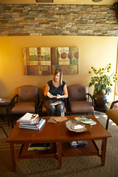
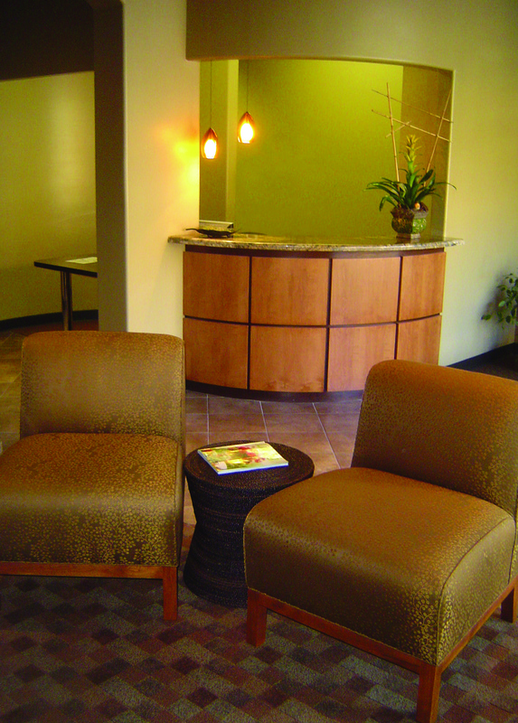
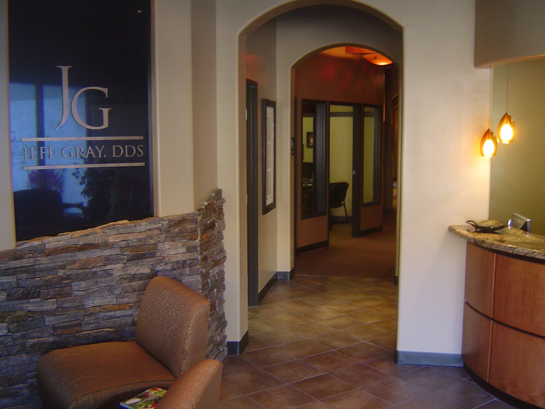
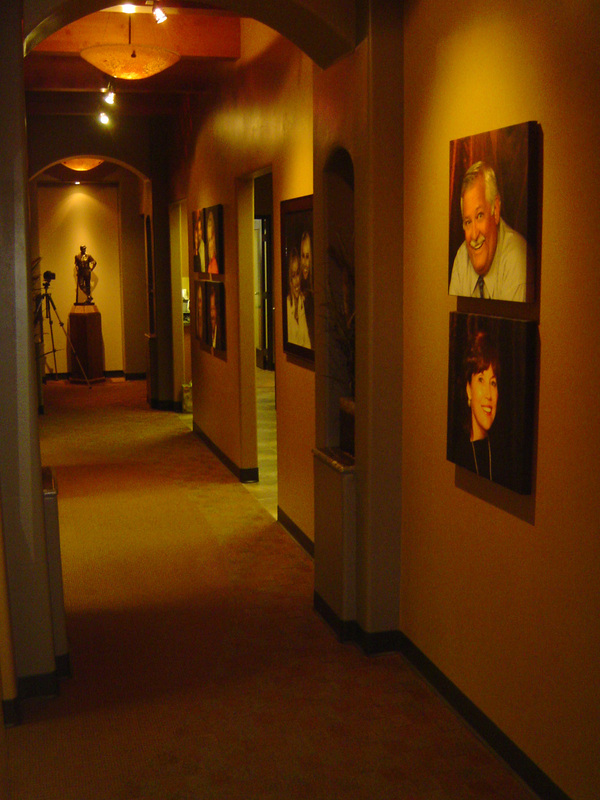
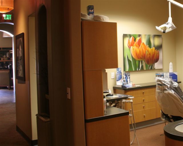
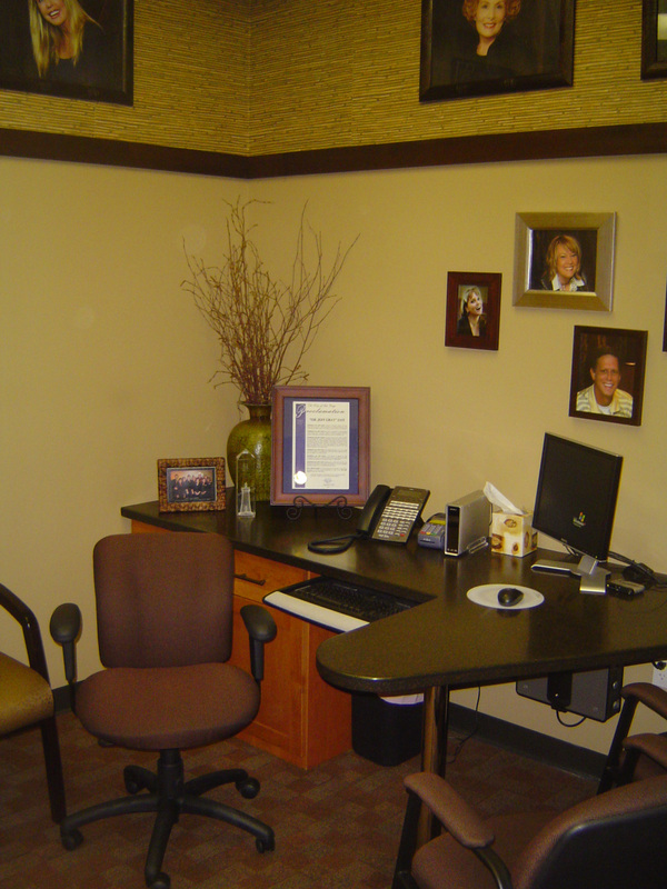
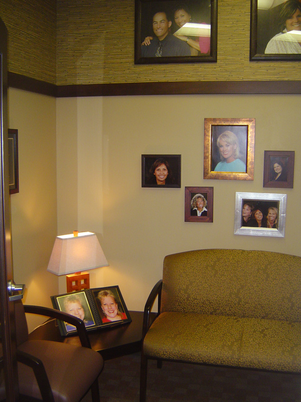
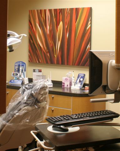
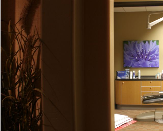
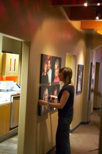
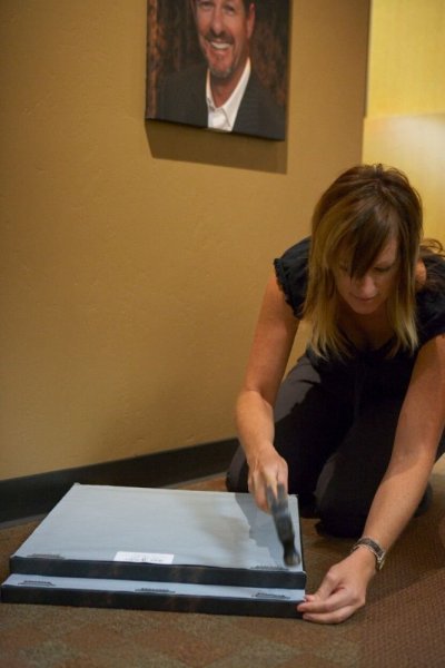
Many times I've waited for my doctor's appointment and wished the waiting room felt more like a home and less like a health institution. When Jeff approached me a couple years ago to work together on his new dental office, I was so glad he wanted to move away from the "typical doctor office lobby" and go more towards a residential feeling with warm friendly colors and rich woods. Finally someone was speaking my "doctor office" language! Jeff's lobby turned out so beautiful I wish I could coin it as my "Diane Luna" look and design every doc lobby in San Diego exactly the same - but then everybody would look like Jeff and his wouldn't be unique. I can't decide what my favorite item is, I think they're all my favorite. The rust, brown and gray colored carpet we did in three different patterns, the combination of brown vinyl and berry-stem olive print on the seating, the rich paint colors, the natural ledger stone... button detail on the chairs, removeable trays underneath the coffee table, hardcover books instead of magazines... if I was Jeff's client I'd want to come early to my appointments just so I could hang out in the lobby! Don't they look like Starbucks chairs? They should - I took a photo of some chairs at Starbucks and gave it to our upholsterer. I did two-toned woods throughout the office, which you can see on the welcome desk face. The granite for the welcome desk countertop is so beautiful, even though can't see it in this photo. Here is the carpet again, in the larger square version. We separated the different carpets down the center using hard surface tile for the traffic area by the front door. Helps keep things clean. There is a curved wall directly behind the receptionist that we are still debating adding an accent color to... not sure if we will. This is the view looking down the hall from the lobby. To the left you can see Jeff's logo that we did in copper laminate on black granite, with the natural stone below it, repeated again. I used dark brown for the metal doors and casings, with a matching dark brown on the rubber base, which added contrast to our color scheme and acts like a frame frames a painting. The hallway I designed to feel like an art gallery. We purposely kept the lighting dim and soft, no fluorescent. There are three Italian hand-blown glass pendants hanging from the ceiling as you walk down, and track lighting to fill in the dark spots and accentuate the photos. The canvas photography is of Jeff's actual patients. Their smiles are beautiful, thanks to Jeff! The arch details hold the building up, but we took advantage of them and added accent color and little alcoves (see detail photo further down). The wood beams look like they hold the building up... but in actuality they are just decorative. I painted the ceiling of the hallway almost-black, for a moody effect. It makes the ceiling look like it disappears.The bronze statue of Casey at the Bat displayed at the end of the hall is representative of Jeff's fundraising effort called "Smiles for Life". There is a long story attached to the statue which I'll save for another blog post. Here's a glimpse from the hall looking back toward the lobby. You can also see the hygiene room to the right. Each hygiene room has beautiful burled wood laminate for the cabinetry with brown-black corian countertops. The dental chairs are charcoal color and so comfortable! The canvas photos are by Quentin Huffaker of Fallbrook, CA, who is a talented photographer and client of Jeff's. The consultation room is a place where clients feel at ease as they discuss the extent of the surgery to be performed on their teeth. As Jeff's specialty is sedation dentistry, many of his clients will experience "extreme makovers" to the structure of their teeth and life-changing improvements to their smiles. I did a commercial grade vinyl grasscloth wallpaper above a high chair rail done in a dark stain. The grasscloth sets off the portraits above beautifully. Around the walls below the chair rail we hung assorted frames, such as you might see on your family photo wall at home. The family feel was very appropriate for this room, as most of Jeff's clients are treated as he would his own family. For the consultation room I repeated the same seating from the lobby with the berry stem fabric on the loveseat and the brown vinyl with button detail for the chair. It's a comfortable place for clients to sit and chat with Jeff and his team. Lots of "before and after" photos for clients to look at in the family photo album on the table.
Comments are closed.
|
Project Stories
All
|
 RSS Feed
